You develop a webpage.
The webpage must display a grid that contains one row and five columns. Columns one, three, and five are the same width. Columns two and four are the same width, but much wider than columns one, three, and five.
The grid resembles the following image:
The grid must meet the following requirements:
• Each row must be tall enough to ensure that images are not cut off.
• Each row must contain five columns.
• The width of the columns must not change when the screen is resized or rotated.
You need to define the style for the grid.
Which CSS3 style should you use?
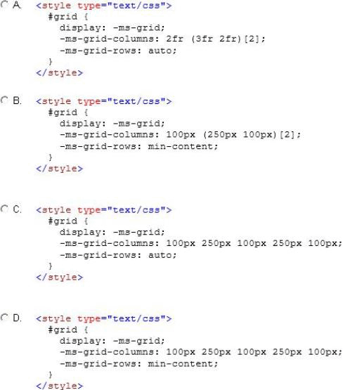
A . Option A
B . Option B
C . Option C
D . Option D
Answer: C
Explanation:
* -ms-grid-rows property
auto
The height of a row is computed based on the tallest child element in that column.
Incorrect:
Not A: The width of the columns must not change when the screen is resized or rotated.
Not B, Not D: -ms-grid-rows property
min-content
The minimum height of any child elements is used as the height of the row.
Note:
* width
The width of each column specified as one of the following values:
A length consisting of an integer number, followed by an absolute units designator ("cm", "mm", "in", "pt", or "pc") or a relative units designator ("em", "ex", or "px").
A percentage of the object width.
A proportion of the remaining horizontal space (that is, the object width, less the combined widths of other tracks), consisting of an integer number followed by a fractional designator ("fr"). For example, if "200px 1fr 2fr" is specified, the first column is allocated 200 pixels, and the second and third columns are allocated 1/3 and 2/3 of the remaining width, respectively.
Leave a Reply